At first, we didn’t set out to build an award-winning design system.
We simply had a problem: too many products, too many brands, and too little consistency.
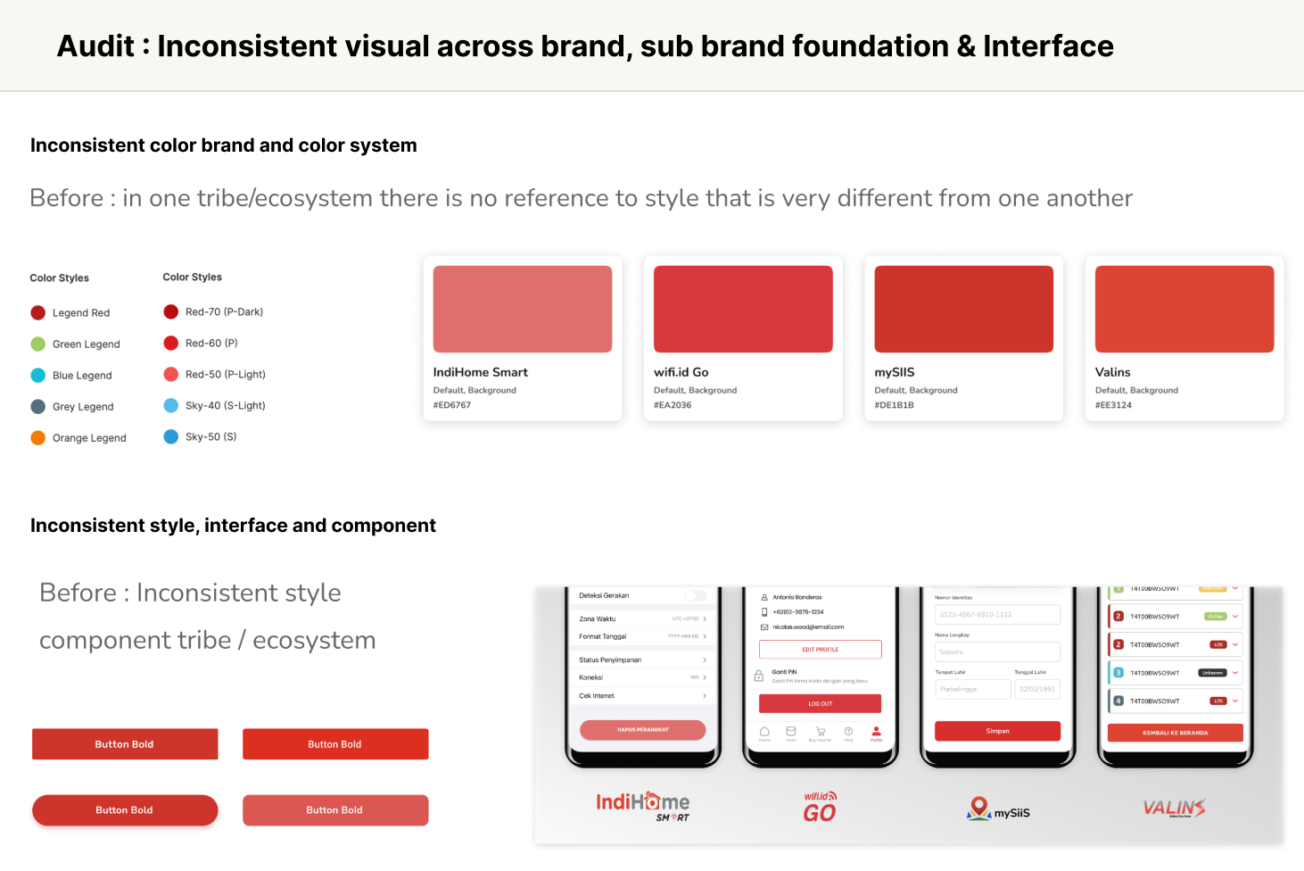
Across the Telkom Group ecosystem, every tribe had its own product identity — colors, typography, tone, interaction styles — all different. Yet behind those logos and themes, they often shared similar features, flows, and infrastructure.
That’s when we realized: if we could unify the underlying system while keeping each brand’s individuality, we could scale design and development across the group — without slowing anyone down.
Design systems are no longer just about reusable components — they’re about scaling consistency across multiple brands and platforms.
When your product ecosystem includes several apps or white-labeled clients, a multi-brand cross-platform design system becomes essential to maintain visual harmony without compromising flexibility.
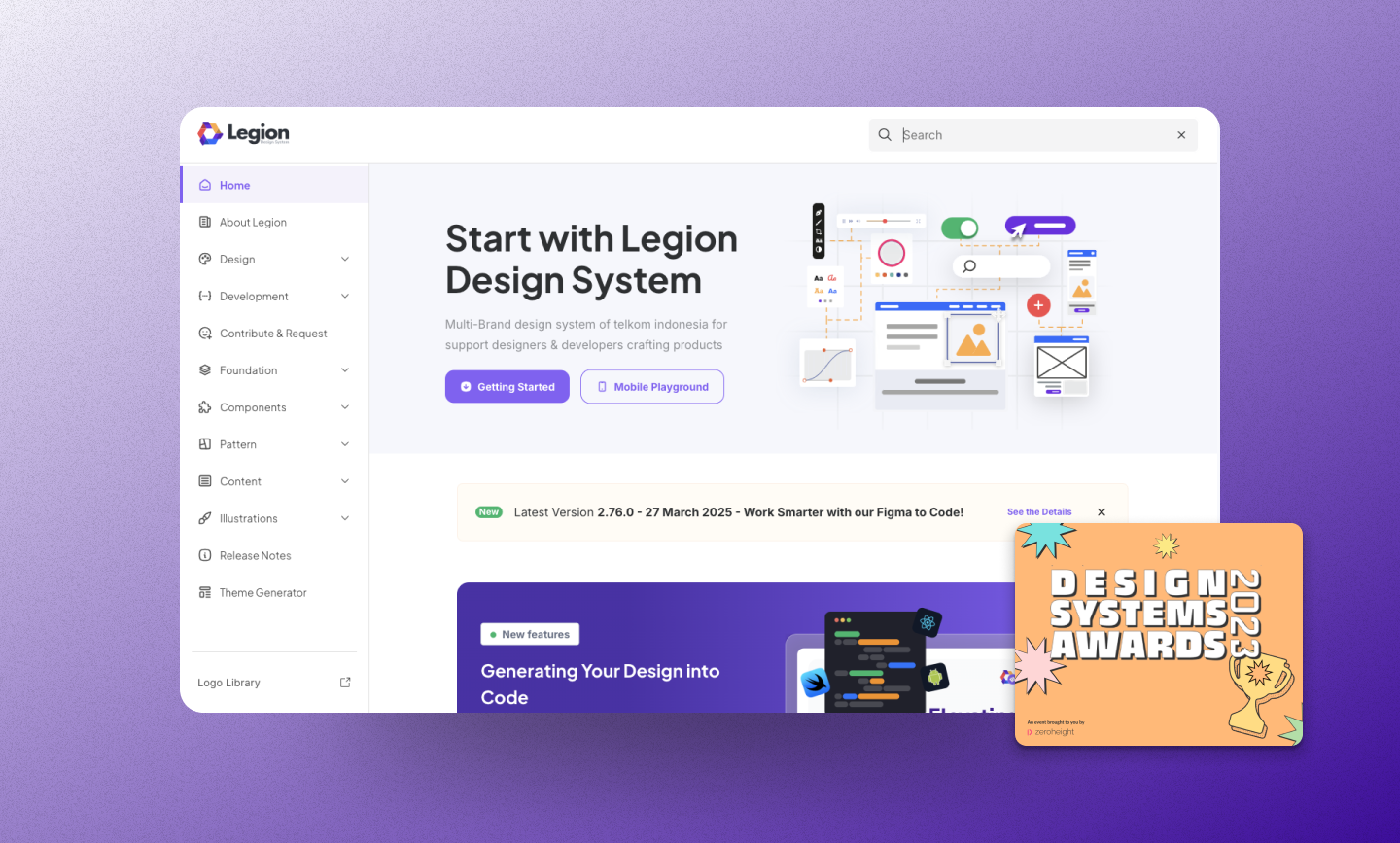
So we built a multi-brand cross-platform design system — one that runs seamlessly on web and mobile, powered by React, Figma, and Tamagui.
The Challenge: Scaling Design Across Different Brands
Each product team had its own style guide, often built in isolation.
When new features needed to be rolled out group-wide, developers had to rebuild them multiple times for different brands.
This led to:
- UI inconsistencies (different paddings, colors, and font weights)
- Code duplication
- Slower iteration across web and mobile
- Difficult handoff between design and development
We needed a foundation that could:
- Keep brand identities distinct, yet technically unified.
- Share components across platforms (React + React Native).
- Automate design token updates directly from Figma.
Our Stack and Approach
| Layer | Tool | Purpose |
|---|---|---|
| Design | Figma + Plugin Figma Tokens | Generate design tokens & brand themes |
| Core UI | React + Tamagui | Cross-platform base components |
| Brand Layer | Dynamic Tokens | Theme switching per brand |
| Docs & Testing | Storybook, Jest, Chromatic | Document and test components |
| CI/CD | Turborepo + Gitlab CI/CD | Auto-build & publish design system packages |
| Monitoring | SonarQube + Lighthouse | Ensure accessibility & performance |
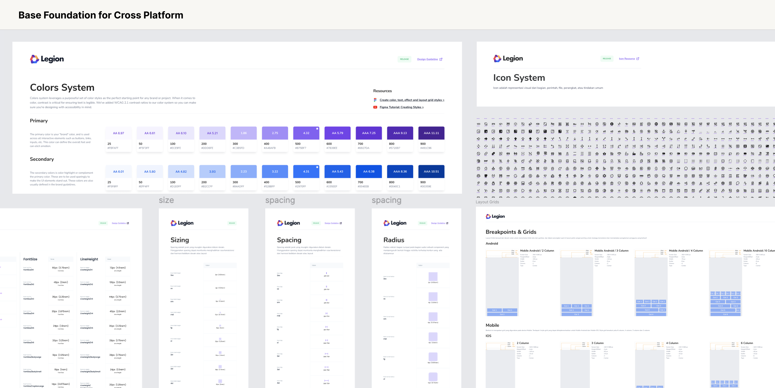
Phase 1: Tokenizing the Brands
We started from Figma.
Designers defined base tokens — colors, typography, spacing, and radii — for each brand. Using Figma Tokens plugin, we exported them automatically as JSON and CSS variables.
We start by defining our design tokens in Figma:
- Colors (
--color-primary,--color-accent) - Typography (
--font-body,--font-heading) - Spacing & radius values
Then use a Figma plugin (like Figma Tokens ) to generate CSS variables automatically.
Example token snippet:
:root {
  --color-primary: #0055ff;
  --color-secondary: #00aaff;
  --font-family-base: "Inter", sans-serif;
}
We customize the plugin to generate css for each figma file owned by different tribes. We then built a script to convert the generated css to our css format. This way, every brand just becomes another theme scope.
Phase 2: Integrating Tokens into React
Using Tamagui, we built a React-based design system that supported both web and native rendering.
We wrapped our components with brand themes like this:
import { TamaguiProvider, Theme } from 'tamagui';
import config from './tamagui.config';

function App({ brand }: { brand: 'brandA' | 'brandB' }) {
  return (
    <TamaguiProvider config={config}>
      <Theme name={brand}>
        <Button>Click Me</Button>
      </Theme>
    </TamaguiProvider>
  );
}
Each Theme corresponds to one brand’s token set — dynamically switchable at runtime. Now, switching brands was just one prop change — no rebuild required.
Phase 3: Making It Truly Cross-Platform
Tamagui allows us to write React components that render to both React Native and React DOM, while maintaining design consistency and performance.
Our design system can live in one package, and apps (web or mobile) can consume it directly:
packages/
  design-system/
    ├─ components/
    ├─ themes/
    ├─ tokens/
    └─ index.ts
  web/
  mobile/
Example shared component :
// packages/design-system/Button.tsx
import { Button as TButton } from 'tamagui';

export const Button = TButton.styleable(({ theme }) => ({
  backgroundColor: '$colorPrimary',
  color: '$colorText',
  borderRadius: '$radiusMd',
  hoverStyle: {
    backgroundColor: '$colorPrimaryHover',
  },
}));
Same code, same tokens — different look per brand and platform.
Phase 4: Testing, CI/CD, and Quality Gates
We integrated Jest for unit testing, Storybook for visual testing, and Chromatic for regression checks.
Before deployment, SonarQube analyzed our code for maintainability and accessibility, ensuring the design system passed strict quality gates.
In our CI/CD pipeline (via GitHub Actions), every merge triggered:
- Lint & test
- Build packages via Turborepo
- Generate Storybook docs
We still have 1 action that needs to be triggered manually (and we let it so, for good reasons): Publish versioned design system to NPM registry
Phase 5: Syncing Figma Tokens with Code
Whenever designers update styles in Figma, we can re-export tokens as JSON or CSS and automatically sync them into your repo using a script.
Workflow:
- Figma plugin exports tokens → tokens/brandA.json
- A script transforms them → Tamagui theme config
- The design system rebuilds automatically
This keeps design and code in perfect sync — no more manual updates.
Phase 6: Documenting Everything in Storybook
Finally, we integrate Storybook to showcase components per brand. We created a unified Storybook hub where teams could:
- Browse components by brand
- Switch themes in real-time
- View code examples, tokens, and Figma links
This hub became the single source of truth — connecting design and code seamlessly. This ensures both design and engineering teams speak the same language.
🏆 The Outcome
In just a few months, the system:
- Reduced UI bugs by over 20%
- Cut design-to-dev handoff time by ~60%
- Increase product delivery time by 34%
- Enabled Multiple brands across telkom group to share one scalable foundation
- Delivered consistent UX across all products — from web dashboards to mobile apps
It was later recognized internally as one of the most impactful cross-team initiatives — an Award-winning design system born from collaboration between design, engineering, and product.
Over time, we also developed reusable templates and patterns from this system, which were then used to accelerate projects for both internal teams and external clients.
Conclusion
Building a multi-brand cross-platform design system isn’t about adding complexity — it’s about removing duplication and empowering scalability.
By combining Figma token automation, React components, and Tamagui’s cross-platform theming, you get a single source of truth for design that adapts to any brand, platform, or device.
Start with small shared components, define brand tokens, and grow your system iteratively — one consistent experience at a time.